CHAPTER IV
FINDINGS
The data collected from the grocery store survey has been analyzed in a variety of ways. The findings of the survey of grocery stores are broken into three categories: (1) geographic, (2) non-geographic, and (3) other. Maps, tables, and correlations have been employed to better illustrate the realities of Akron's inner city.
Geographic
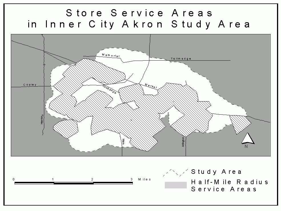
Most areas in inner city Akron were relatively close to a food
store (Fig. 2) when considering a half-mile travel distance or
"service area". The area covered by store service areas
is 14.5 square miles, or 56 percent of the more than 25 square
mile study area. Some of these areas have fewer residential
spaces than others, but the northern portion of Akron, known as
"North Hill", where many people live, had no food
stores within the survey area. Table 1 contains the number of
people that live within each store's service area.
Population, household incomes, public assistance, vehicle availability per household, and high school graduation rates of all persons over 25 were calculated for all store service areas (Table 1). The geographic distributions of household income, public assistance, vehicle availability, and high school graduation in the study area are shown in Figs. 3, 4, 5, and 6.
Figure 2. Store Service Areas in Inner City Akron Study Area

Table 1: Demographics of Store Service Areas
| Store Name | Population | Median Household Income ($) |
Public Assistance Income (%) |
Vehicle Availability (per hhld.) |
High School Graduates (%) |
| Aldi | 1,843 | 13,589 | 32 | 1.12 | 56 |
| Asia Market | 3,669 | 20,545 | 14 | 1.43 | 64 |
| Baho Convenience Store | 3,712 | 18,289 | 16 | 1.25 | 73 |
| BiRite Market | 3,740 | 19,465 | 20 | 1.36 | 66 |
| Bob's Supermarket | 1,300 | 10,351 | 36 | 1.11 | 49 |
| Convenient Food Mart | 1,238 | 26,317 | 8 | 1.88 | 66 |
| Country Market | 3,493 | 14,332 | 24 | 1.34 | 63 |
| Dairy Mart | 4,305 | 16,864 | 13 | 1.21 | 77 |
| DB's Check Mart | 2,990 | 14,733 | 28 | 1.26 | 56 |
| Delia Market | 5,265 | 22,807 | 20 | 1.40 | 75 |
| Deli Mart | 2,700 | 8,240 | 37 | 0.85 | 48 |
| Empress Market | 3,667 | 14,900 | 12 | 1.44 | 71 |
| EZ Quick Stop | 3,826 | 18,323 | 20 | 1.47 | 63 |
| Family Market | 2,715 | 14,433 | 26 | 1.36 | 59 |
| Faris Market | 3,200 | 13,881 | 37 | 1.15 | 47 |
| Far-Less Food Market | 2,980 | 14,692 | 20 | 1.30 | 62 |
| Firestone Mini-Mart | 4,339 | 27,530 | 7 | 1.73 | 78 |
| Kelly Market Groceries | 1,963 | 13,435 | 34 | 1.06 | 63 |
| Lakeshore Carry-Out | 2,021 | 10,498 | 49 | 1.04 | 51 |
| Linda's Market | 4,145 | 15,632 | 28 | 1.31 | 63 |
| Little Mike's Market | 2,128 | 12,302 | 39 | 1.16 | 47 |
| Lucky's Deli & Carry-Out | 2,991 | 14,582 | 26 | 1.23 | 56 |
| Main Street Market | 1,594 | 15,595 | 21 | 0.81 | 71 |
| Mr. Pantry | 4,236 | 23,252 | 24 | 1.45 | 67 |
| Olives Food Store | 3,619 | 20,320 | 14 | 1.42 | 64 |
| Oriental Market | 3,503 | 14,939 | 15 | 1.28 | 67 |
| P & F Carry-Out | 2,894 | 14,370 | 16 | 1.27 | 66 |
| Reem's Market | 3,315 | 26,899 | 5 | 1.62 | 73 |
| Rocky's Market | 2,032 | 12,262 | 33 | 1.04 | 58 |
| Roush's Market | 2,265 | 13,136 | 31 | 1.24 | 51 |
| Smitty's Market | 1,613 | 13,295 | 31 | 1.18 | 47 |
| South Street Express | 3,085 | 13,808 | 26 | 1.27 | 62 |
| Spice Corner | 3,657 | 14,822 | 12 | 1.45 | 71 |
| Star Market | 4,959 | 23,285 | 9 | 1.34 | 87 |
| Tasty Carry-Out | 1,937 | 13,278 | 31 | 1.18 | 47 |
| United Asian Market | 3,306 | 13,862 | 25 | 1.30 | 62 |
| Wooster Market | 2,615 | 7,905 | 36 | 0.80 | 47 |
| Zip Mart | 4,454 | 10,636 | 6 | 1.57 | 81 |
| Source: US Census Bureau, 1990b | |||||
Figure 3. Median Household Incomes for Store Service Areas
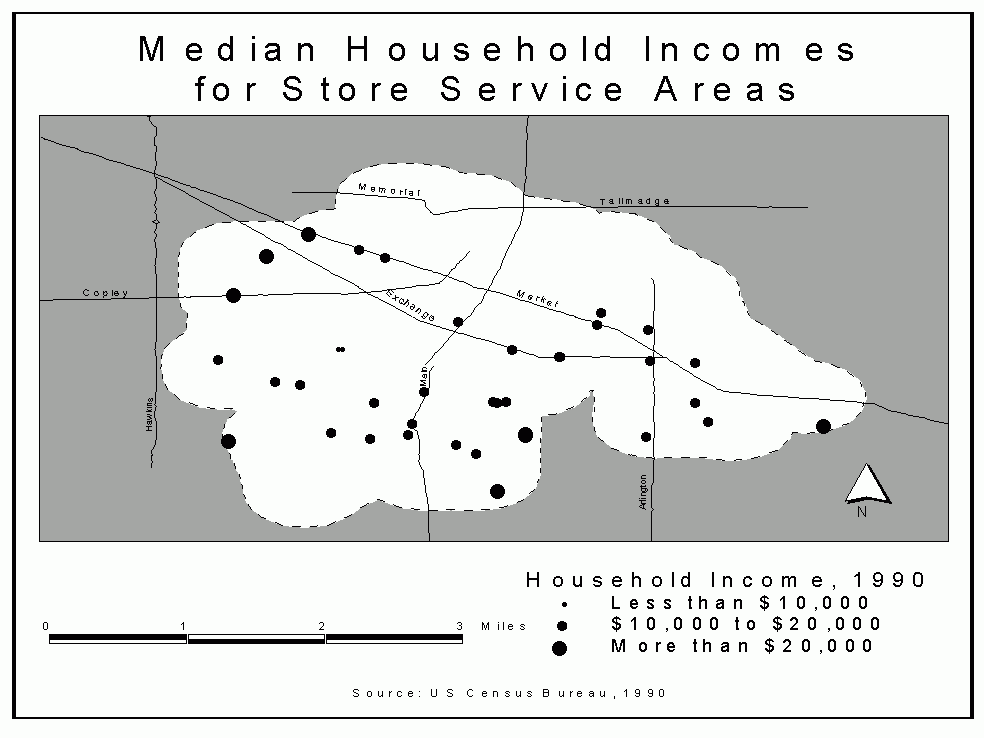
Figure 4. Households Receiving Public Assistance Income per Store Service Area
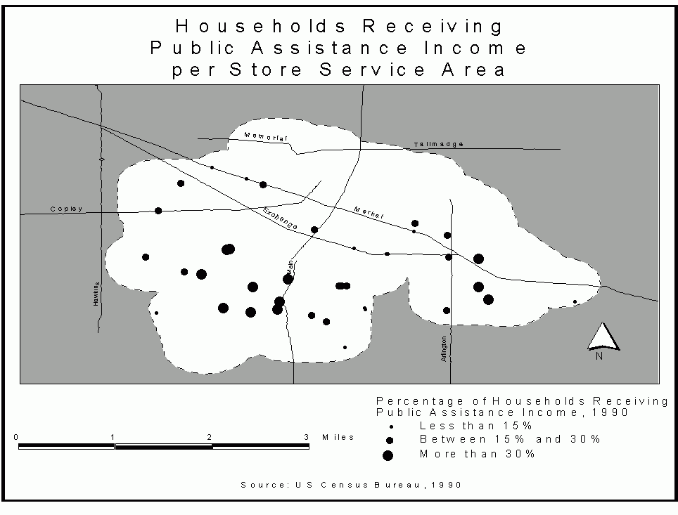
Figure 5. Vehicles per Household for Store Service Area
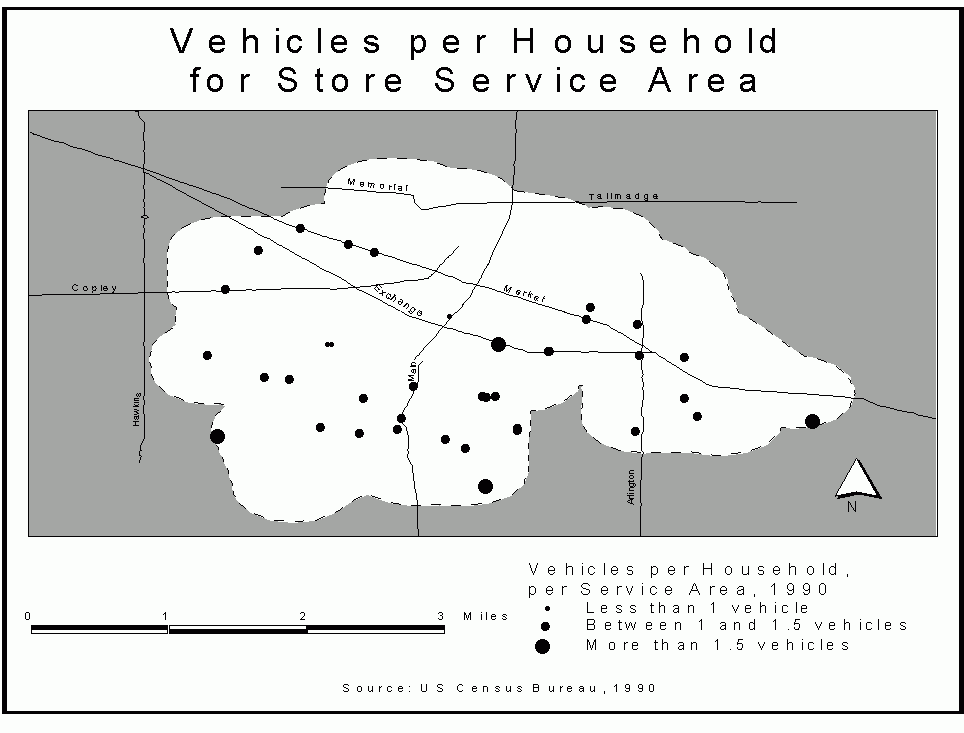
Figure 6. High School Graduates per Store Service Area
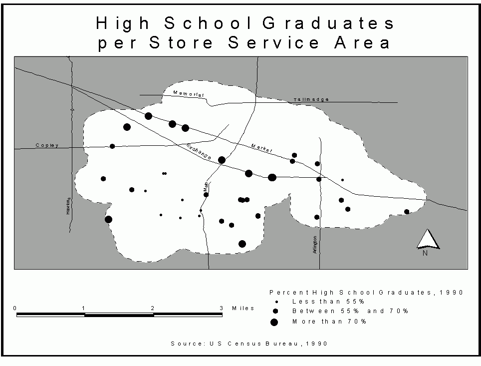
The median values for service area demographics were calculated, and low and high values noted (Table 2). These demographic ranges for store service areas show the geographical variations between the service areas and inform the analysis as to how each store serves a different population. The store with the least populated service area was the Convenient Food Mart on Massillon Road (1,238 people in its service area) and the store with the most populated service area was the Delia Market on Delia Avenue (5,265 people). The most impoverished service area is that of the Wooster Market on Wooster Avenue ($7,905), while the most affluent service area is the Firestone Mini-Mart on Aster Avenue ($27,530). The area with the highest public assistance income dependence is for Lakeshore Carry-Out's service area (49 percent) and the lowest is the Reem's Market service area (5 percent). The highest level of vehicle availability is found in the Convenient Food Mart service area (1.88 vehicles per household) and the lowest vehicle availability in the Wooster Market service area (0.80 vehicles per household). The highest level of high school graduates is at the Star Market's service area (87 percent), while the lowest level of high school graduates occurred at four different store service areas: Faris Market, Little Mike's Market, Smitty's Market, and Wooster Market (all at 47 percent).
Table 2: Summary of Store Service Area Demographics
| Demographic | Low | Median | High |
| Population | 1,238 | 3,143 | 5,265 |
| Household income ($) | 7,905 | 14,637 | 27,530 |
| Public assistance (% of hhlds.) | 5 | 24 | 49 |
| Vehicles per household | 0.80 | 1.28 | 1.88 |
| High School graduates (%) | 47 | 63 | 87 |
| Source: US Census Bureau, 1990b | |||
According to Christaller's theory on central place, grocery store service areas have limited ranges that form thresholds between service areas. Customers will tend to travel to the closest available store and will not cross these theoretical thresholds to get food (Berry and Harris, 1970).
There was a significant correlation between the demographics of the service areas: the smaller the household income, the fewer vehicles available, the more likely to be receiving public assistance income, and the less likely to have graduated from high school. Conversely, the higher the household income, the more vehicles available, the less likely to be receiving public assistance income, and the more likely to have graduated from high school. This trend is not too surprising, since it is a rather uniform cultural phenomenon. Race (Black/White) was also examined as a demographic variable, but it did not correlate to any of the variables.
The three main characteristics of food stores (availability, cost, and public assistance) had varying correlation results. Food item availability increased with lower household incomes (Table 3), higher levels received public assistance (Table 4), and fewer vehicles (Table 5). Food prices (considering both mean and median prices) corresponded with lower household incomes, more public assistance income, and fewer vehicles. Food stamps tended to be less accepted at stores where more households received public assistance income, fewer vehicles were available, and fewer were likely to have graduated from high school (Table 6). WIC was not significantly correlated to any of the tested demographic variables.
Table 3: Food Item Availability Correlated to Service Area Characteristics
| Variable | Significance | Pearson |
| Median Household Income | .003 | -.437 |
| Public Assistance Income | .031 | .305 |
| Vehicle Availability | .010 | -.376 |
| High School Graduates | .063 | -.253 |
| Source: US Census Bureau, 1990b | ||
Table 4: Cost Correlated to Service Area Characteristics
| Variable | Significance | Pearson |
| Median Household Income | .021 | .332 |
| Public Assistance Income | .009 | -.385 |
| Vehicle Availability | .018 | .342 |
| High School Graduates | .118 | .197 |
| Source: US Census Bureau, 1990b | ||
Table 5: Food Stamp Acceptance Correlated to Service Area Characteristics
| Variable | Significance | Pearson |
| Median Household Income | .136 | .183 |
| Public Assistance Income | .008 | -.389 |
| Vehicle Availability | .049 | .273 |
| High School Graduates | .034 | .300 |
| Source: US Census Bureau, 1990b | ||
Table 6: WIC Acceptance Correlated to Service Area Characteristics
| Variable | Significance | Pearson |
| Median Household Income | .246 | -.115 |
| Public Assistance Income | .361 | .060 |
| Vehicle Availability | .054 | -.265 |
| High School Graduates | .424 | -.032 |
| Source: US Census Bureau, 1990b | ||
Thus, although food item availability and prices are related in a positive way for those who would be at greater risk of food insecurity, food stamps acceptance is related in a negative fashion.
The racial composition of each store's service area (Table 7) is as mixed as Akron itself. The segregated service areas range from one percent Black and 98 percent White (Convenient Food Mart) to 93 percent Black and six percent White (Bi Rite Market), while the most integrated service area is 47 percent Black and 50 percent White (Kelly Market Groceries).
Table 7: Racial Composition of Store Service Areas
| Store Name | Service Area % White |
Service Area % Black |
Service Area % Other |
| Aldi | 52 | 40 | 8 |
| Asia Market | 79 | 19 | 2 |
| Baho Convenience Store | 66 | 31 | 3 |
| BiRite Market | 6 | 93 | 1 |
| Bob's Supermarket | 82 | 18 | 0 |
| Convenient Food Mart | 98 | 1 | 1 |
| Country Market | 78 | 15 | 7 |
| DB's Check Mart | 18 | 81 | 1 |
| Dairy Mart | 72 | 26 | 2 |
| Deli Mart | 8 | 91 | 1 |
| Delia Market | 42 | 57 | 1 |
| EZ Quick Stop | 76 | 22 | 2 |
| Empress Market | 87 | 9 | 4 |
| Family Market | 85 | 11 | 4 |
| Far-Less Food Market | 50 | 41 | 9 |
| Faris Market | 96 | 3 | 1 |
| Firestone Mini-Mart | 20 | 80 | 0 |
| Kelly Market Groceries | 50 | 47 | 3 |
| Lakeshore Carry-Out | 36 | 61 | 3 |
| Linda's Market | 63 | 32 | 5 |
| Little Mike's Market | 82 | 15 | 3 |
| Lucky's Deli & Carry-Out | 75 | 22 | 3 |
| Main Street Market | 13 | 86 | 1 |
| Mr. Pantry | 79 | 19 | 2 |
| Olives Food Store | 84 | 11 | 5 |
| Oriental Market | 84 | 11 | 5 |
| P & F Carry-Out | 97 | 2 | 1 |
| Reem's Market | 23 | 77 | 0 |
| Rocky's Market | 13 | 86 | 1 |
| Roush's Market | 71 | 22 | 7 |
| Smitty's Market | 77 | 15 | 8 |
| South Street Express | 87 | 12 | 1 |
| Star Market | 87 | 9 | 4 |
| Spice Corner | 68 | 25 | 7 |
| Tasty Carry-Out | 67 | 32 | 1 |
| United Asian Market | 77 | 14 | 9 |
| Wooster Market | 10 | 89 | 1 |
| Zip Mart | 82 | 11 | 7 |
| Source: US Census Bureau, 1990b | |||
Ethnic food stores
Not all grocery stores in Akron are "basic American
food" stores. In Akron there are a small number of Asian
grocery stores that specialize in specific ethnic foods. In order
to properly evaluate whether the dietary needs of Asians are
being met, it is important to look at these stores.
An ethnic food store primarily sells food items that are distinctly non-traditional American, often catering to immigrants from specific geographic regions. The geographic mean center of the four Asian ethnic grocery stores in the study area (Table 8) falls .07 miles east of the 500s block of Spicer St. (just south of The University of Akron campus). The two stores farthest apart from each other (Oriental Market and Asia Market) are only two miles apart. These stores are all located in East-Central Akron and are in close proximity to The University of Akron.
Table 8: Ethnic Grocery Stores in Akron
| Store Name | Address | Ethnicity | Percent of Service Area "Asian / Pacific Islander" |
| Asia Market | 986 Brown St. | East Asian | 1.1 |
| Oriental Market | 597 East Market St. | East Asian | 3.7 |
| Spice Corner | 519 East Exchange St. | South Asian | 3.2 |
| United Asian Market | 340 East South St. | East Asian | 6.5 |
| Source: US Census Bureau, 1990b | |||
Despite what one may expect, there is not a significant correlation between the concentration of persons of Asian/Pacific Islander heritage and the location of ethnic grocery stores in Akron (Table 9). The degree of confidence that can be placed on this test could be affected by the datedness of the Census information.
Table 9: Correlation of Asian/Pacific Islanders and Ethnic Grocery Stores
| Pearson | Significance |
| .227 | .085 |
| Source: US Census Bureau, 1990b | |
Non-Geographic
Availability
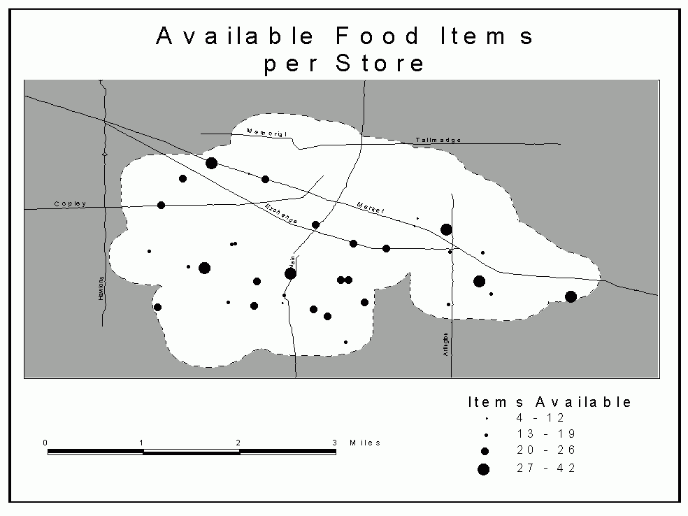
The mean and median number of items available at the surveyed
stores was 20 (Table 10). This indicates that the majority of
stores had just less than half the items indicated by the USDA.
The store with the highest availability was the Star Market
having all food items, while the store with the least
availability was the Oriental Grocery (a relatively new East
Asian ethnic market) having only three recommended food items -
which is understandable since it is a more specialized store. The
stores of inner city Akron also had less than half of the
available food items of the control store's 41 items (Fig. 7).
Table 10: Availability of Food Items
| Rank | Food Item | Quantity | Percentage |
| 1 | Green beans | 34 | 89 |
| 1 | Granulated sugar | 34 | 89 |
| 3 | Tomato sauce | 33 | 87 |
| 3 | Noodles | 33 | 87 |
| 3 | Vegetable Oil | 33 | 87 |
| 6 | Bread | 31 | 82 |
| 6 | Flour | 31 | 8 |
| 6 | Whole milk | 31 | 28 |
| 9 | Eggs | 30 | 79 |
| 9 | Margarine | 30 | 79 |
| 11 | Tuna | 28 | 74 |
| 11 | Kidney beans | 28 | 74 |
| 13 | Orange juice | 26 | 68 |
| 13 | Macaroni | 26 | 68 |
| 13 | Rice | 26 | 68 |
| 16 | Peaches | 25 | 66 |
| 17 | Evaporated milk | 24 | 63 |
| 17 | Shortening | 24 | 63 |
| 17 | Salad dressing | 24 | 63 |
| 20 | Brown sugar | 24 | 63 |
| 21 | Hamburger buns | 21 | 55 |
| 22 | Corn flakes | 17 | 45 |
| 23 | Potatoes | 14 | 37 |
| 23 | Cheddar cheese | 14 | 37 |
| 25 | Onions | 13 | 34 |
| 26 | 1% milk | 12 | 32 |
| 27 | Leaf lettuce | 10 | 26 |
| 27 | Bread crumbs | 10 | 26 |
| 29 | Apples | 8 | 21 |
| 29 | Green pepper | 8 | 21 |
| 29 | Peas | 8 | 21 |
| 29 | Ground turkey | 8 | 21 |
| 29 | Garbanzo beans | 8 | 21 |
| 34 | Bananas | 7 | 18 |
| 34 | Celery | 7 | 18 |
| 36 | Fish | 6 | 16 |
| 37 | Carrots | 5 | 13 |
| 37 | Turkey ham | 5 | 13 |
| 39 | Chicken | 4 | 11 |
| 40 | Ground beef | 3 | 8 |
| 41 | Bagels | 2 | 5 |
| 42 | Melons | 1 | 3 |
Figure 7. Available Food Items per Store
Food group availability
The survey food list is split into food groupings (fruits and
vegetables: 15; breads, cereals, and grains: 9; milk and cheese:
4; meat and meat alternatives: 9; and fats, oils, and sugars: 6).
The most available food group is the fats, oils, and sugars (74
percent), while the least available is the meats (36 percent).
This is followed closely by the fruits and vegetables (37
percent) (Table 11). The control store did much better with 100
percent of all food groups, except for missing one meat group
item.
Table 11: Availability of Food Groups
| Food Groups | Total items in group | Accumulative foods found | Percentage available |
| Fruits and vegetables | 14 | 198 | 37 |
| Breads, cereals, and grains | 9 | 199 | 58 |
| Milk and cheese | 4 | 81 | 53 |
| Meat and meat alternatives | 9 | 124 | 36 |
| Fats, oils, and sugars | 6 | 169 | 74 |
| All food groups | 42 | 772 | 48 |
| Source: Hogbin, et al. (1999) | |||
Due to an unfortunate oversight, one fresh fruit (orange) was missed during the entire survey period. All analysis has been done with this subtraction, thus the total items surveyed were 42, not 43. Yet, had the orange been included and since most stores did not stock oranges, it likely would have exacerbated the trends for most stores and the fruits and vegetables food group.
The situation in Akron stores is the opposite of an ideal nutritional situation. Perishability likely plays a factor in these deficits: meats, fruits, and vegetables usually have shortened-shelf lives and go bad more easily than do fats, oils, and sugars. This is supported by Curtis and McClellan (1995, 116).
Cost
All food items were standardized to common units. In most cases,
this unit was ounces. Those items not standardized by ounces were
melons (halves), celery (stalks), lettuce (heads), bread
(loaves), hamburger buns (buns), and eggs (eggs). Apples, green
pepper, onions, and potatoes were split amongst weight (ounces)
and quantity (count) items, because some were sold at different
measures. All of those food items counted on the basis of their
quantity undoubtedly varied in weight, thus making a precise
comparison in most cases impossible.
The mean price for each individual food item amongst all the stores was compared with the price from the control store. Also, the prices of a given store were contrasted with those of all other stores to see which stores were more affordable.
Only seven of the products that had standard units (38 did) were more inexpensive on average than the control (primarily produce and meats) and eight items had lower median prices than the control (Table 12). Often produce was not labeled with a price, so I had to ask the store manager for the price. A number of them told me that they haggled with customers or that they would deliberately undersell the item just to sell it. There is also the possibility that they told me a lower price when asked, just to make it seem as if their store was less expensive.
Table 12: Inner-city Store Items Less Expensive Than Control Store
| Mean Items Less Expensive Than Control |
Price Difference ($) | Median Items Less Expensive Than Control |
Price Difference ($) | |
| 1 | Bananas | 0.16 | Bananas | 0.10 |
| 2 | Carrots | 0.57 | Carrots | 0.60 |
| 3 | Celery | 0.82 | Lettuce | 0.70 |
| 4 | Lettuce | 0.58 | Bagels | 0.20 |
| 5 | Bagels | 0.20 | Bread crumbs | 0.20 |
| 6 | Ground beef5 | 0.31 | Ground Beef | 0.28 |
| 7 | Chicken | 0.24 | Chicken | 0.41 |
| 8 | -- | -- | Garbanzo beans | 0.12 |
The items that are less expensive than the control store are some items that are typically less available in stores. These items numbered less than ten, indicating that these results should suggest a lower confidence of being truly less expensive. These items had the following counts: bananas (7), carrots (5), lettuce (10), bagels (2), bread crumbs (10), ground beef (4), chicken (5), and garbanzo beans (8).
One explanation for the less expensive produce could be that some grocery owners/managers will stock produce items, even though they might not be in high-demand or may not make any profit on them, but perhaps stock them on principle. A number of store managers stated that they carry certain items that are in low demand simply because they believe that their store should have those items. Unfortunately, as a result of them often being smaller stores, they will sit longer on shelves and therefore the condition of the produce is often poorer than larger supermarkets. All standard unit food items and their prices are shown in Table 13.
Table 13: Price Difference Between Stores Surveyed and Control
| Food Item | Average unit size | Mean Cost ($) | Median Cost ($) | Control Cost ($) |
| Bananas | 1 pound | 0.43 | 0.49 | 0.59 |
| Melons | 1 half-melon | 1.29 | 1.29 | 0.74 |
| Carrots | 2 pounds | 1.21 | 1.18 | 1.78 |
| Celery | 1 stalk | 1.21 | 1.34 | 1.29 |
| Lettuce | 1 head | 1.21 | 1.09 | 1.79 |
| Peaches | 15.25 ounces | 1.26 | 1.29 | 0.68 |
| Tomato sauce | 15 ounces | 0.99 | 0.99 | 0.40 |
| Orange juice | 1 half-gallon | 2.67 | 2.49 | 1.70 |
| Green beans | 14.5 ounces | 1.08 | 0.89 | 0.63 |
| Peas | 1 pound | 1.38 | 1.41 | 1.29 |
| Bread crumbs | 15 ounces | 1.73 | 1.29 | 1.49 |
| Bread | 1 loaf | 1.34 | 1.29 | 0.89 |
| Hamburger buns | 8 buns | 1.51 | 1.79 | 0.89 |
| Corn flakes | 18 ounces | 3.20 | 2.99 | 1.87 |
| Flour | 5 pounds | 3.49 | 2.29 | 1.59 |
| Macaroni | 1 pound | 1.20 | 1.29 | 0.89 |
| Noodles | 1 pound | 1.15 | 1.22 | 0.66 |
| Rice | 1 pound | 0.86 | 0.80 | 0.58 |
| Evaporated milk | 12 ounces | 1.29 | 1.29 | 0.89 |
| 1% milk | 1 gallon | 2.64 | 2.79 | 2.49 |
| Whole milk | 1 gallon | 2.88 | 2.89 | 2.49 |
| Cheddar cheese | 8 ounces | 2.39 | 2.24 | 2.00 |
| Tuna | 6 ounces | 0.99 | 0.99 | 0.69 |
| Kidney beans | 15.5 ounces | 0.83 | 0.78 | 0.38 |
| Garbanzo beans | 15.5 ounces | 1.10 | 0.84 | 0.96 |
| Eggs | 1 dozen | 1.15 | 1.19 | 0.83 |
| Margarine | 1 pound | 1.11 | 1.09 | 0.79 |
| Shortening | 3 pounds | 4.20 | 3.09 | 2.27 |
| Salad dressing | 16 ounces | 3.02 | 3.19 | 2.00 |
| Vegetable oil | 48 ounces | 3.59 | 3.34 | 2.19 |
| Brown sugar | 1 pound | 1.12 | 1.09 | 0.70 |
| Granulated sugar | 5 pounds | 3.20 | 2.99 | 2.00 |
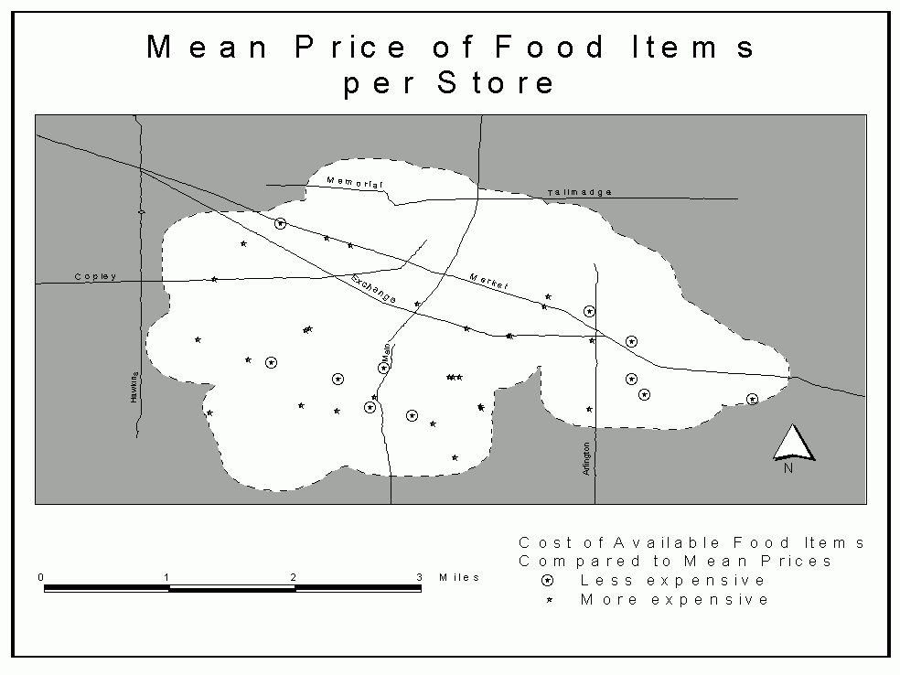
Only 11 stores had an average cost less than the average, while 27 were greater than the average cost.6 Four were between 150 percent to 200 percent average cost. This comparison was made by comparing each item's per unit price to the median price for that item for all stores (Fig. 8 shows the distribution of average food costs per store). The central core is the most expensive region in the study area, with much of the periphery, especially in the east and part of the south being overall less expensive.
Figure 8. Mean Price of Food Items per Store
The only item that did not have a more frequent unit size to utilize was the bagels. Since only two stores had bagels, the average of the two sizes (21 oz and 22 oz) was used (21.5 oz). Also, the non-standard unit items (apples, green peppers, onions, and potatoes) had to be discounted.
Acceptance of public assistance
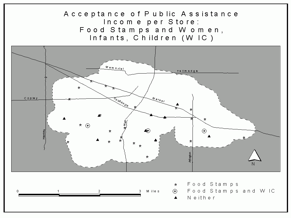
Less than eight percent of the stores surveyed accepted WIC
coupons, even though more than three-fourths accepted food stamps
(Table 14). Only one in ten that did accept food stamps also took
WIC (Fig. 9). When asked if WIC was accepted, four store managers
said that they had recently applied for the program. One also
said that it had been turned down for it, likely due to a lack of
available items. Two also said that in the future they would
apply or re-apply for the food stamp program. The control store
accepted both food stamps and WIC.
Table 14: Acceptance of Public Assistance Income
| Status | Count | Percentage of Total |
| Food Stamps: Accept | 29 | 76 |
| Food Stamps: Do not accept | 9 | 24 |
| WIC: Accept | 3 | 8 |
| WIC: Do not accept | 35 | 92 |
Figure 9. Acceptance of Public Assistance Income per Store: Food Stamps and Women, Infants, Children (WIC)
Two of the pre-conditions for a store to be an approved WIC vendor are as follows (Ohio Department of Health, 2001b):
There was a significant correlation between the acceptance of WIC and the availability of items (Table 15). Both WIC and food stamps correlate with availability of food items when including the control store into the analysis (Table 16).
Table 15: Public Assistance Correlated with Item Availability
| Variable | Significance | Pearson |
| Food stamps | .059 | .258 |
| WIC | .012 | .368 |
Table 16: Public Assistance Correlated with Item Availability (Including Control Store)
| Variable | Significance | Pearson |
| Food stamps | .047 | .272 |
| WIC | .001 | .471 |
It could not be verified how many other stores may potentially be able to become WIC vendors based upon the availability of the food items. One of the items was omitted from the survey (peanut butter) because it was not on the USDA recommended list and four other items were surveyed in a way that does not clearly apply to WIC (Ohio Department of Health, 2001a). Specific types of milk, cheese, cold cereal, and beans were surveyed rather than any kind allowed by the WIC program.
Other
Store names
The stores surveyed used different naming conventions, such as
"Carry-out" (four stores), "Market" (21
stores), and "Mart" (six stores). A very moderate
hierarchy could be found in these store names and the
availability of food items in them (Table 17). This phenomenon is
a coincidence and not a planned pattern since there are no legal
requirements regarding store names for grocery store businesses.
Table 17: Items Available Contrasted to Store Labels
| Label | Count | Mean Number of Items | Median Number of Items |
| Carry-out | 4 | 16.5 | 18 |
| Market | 21 | 20.7 | 21 |
| Mart | 6 | 19.7 | 18 |
The "Markets" had more items than both the "Marts" and "Carry-outs", while the "Marts" were marginally better stocked than the "Carry-outs". However, this was not a significantly correlated relationship and should not be interpreted as such. Ethnic grocery stores named "Markets", which had far fewer items than average, significantly affected these results.
Brands
Some food items were dominated by a majority brand throughout the
city. These items include carrots (Look Mom!), peaches (Del
Monte), bread (Wonder), corn flakes (Kelloggs), flour (Gold
Medal), evaporated milk (Carnation), tuna (Starkist), and brown
sugar (Domino). For the food items listed, more than half of the
stores that carried that item were of the same brand name; for
example, 25 stores had peaches, of which 15 (60 percent) were of
the Del Monte brand. Other items were close to having a dominant
brand, but fell short of having a majority.
An important reason that the control store had, on average, far lower prices than the others was due to its in-house or store brands. More than two-thirds of all surveyed items were of the brands "Best" or "Acme".7
[5] Ground beef and chicken price differentials (for both mean and median) were assumed to be per pound, even though that was not the most prevalent size.
[6] Snow (2002) noted in February 2002 that Akron-area food prices rose 2.96 percent recently, the largest quarterly increase in more than a year. She indicates that this represents a national trend that will see food prices rise up to three percent in the coming year.
[7] For more on the issue of product brands, see Klein (2000).